Friday, 2 May 2014
Thursday, 1 May 2014
Ancillary texts
did a mock up of the CD case itself to see how it would look when made:
Along with doing a CD I considered the idea of if the music video had a matching shirt to go along with the CD case, so I did a quick mock up on Photoshop of a possible design which could be used for publicity and to reach a wider audience.
Wednesday, 30 April 2014
Evaluation
In what ways does your media product use, develop or challenge forms and conventions of real media products?:
These characters were designed with the idea of them being simple showing no features, as I wanted it to be able to represent a large variety of people so I kept the idea of silhouettes and cut outs only really showing their movements. As I wanted more people to be able to relate to the characters, a lot of the research I did helped me with character design. The main inpiration for the idea of silhoette characters came from a shot in the animated music video 'I have you heart' which is a collaboration between:
Jim Batt - Animator
Molly Crabapple - Illustrator
Kim Boekbinder - Musician
The shot:
Character designs of both sides used:
How did you use media technologies in the construction and research, planning and evaluation stages?
It showed an example of how the details on the character weren't needed to understand who they are and what stereotype they belong, for example the fat rich corrupt man and the doctor in a long lab coat.
Character designs of both sides used:
Stuart Hall's theory (1980) demonstrates that even though one message is sent out, that not one understanding is made from the text and allows for a media text to be consumed individually and takes in to consideration the meaning of a text and the relationship an individual person may understand from this in connection to sociological factors. Hall wrote about 3 different types of audience readings of the text: Dominant or preferred – completely agree with the chosen message by the producer
· Negotiated -Partial agreement, opinion is presented ending in compromise
· Oppositional – Disagree completely and rejects the preferred reading
I mentioned this theory as I want the message of my music video to be clear. My music video is based on a song about love and death so I wanted it to be clear what it was about using symbols stereotyped or mentioned with the lyrics and then using a couple in the video. Levi Strauss's theory is of the contrast of Binary opposites for example good vs Evil and Light Vs Dark. The audience doesnt just understand words on just meaning but also the reflecting opposite. The understanding of the idea of a villain depends entirely on our understanding of the world as one member of the audience may perceive 'evil' differently to another person. The theory enables the audience to have an understanding of the narrative before it even begins and having opposites within the media allows for a climax and equilibrium to make it more interesting to the audience. Although I don't have a set character for the role of villain or hero, this theory also still applies to my work with the idea of life and death, with life being the positive and death being the negative role and the video follows the idea of the battle between the two forces.
How did you use media technologies in the construction and research, planning and evaluation stages?
Other Media Technologies not included on the Prezi are:
Youtube: Also used in research and not just presenting my work. Using this website I was able to research a large variety of existing music videos which helped me plan out my own video based on codes and conventions gathered from these videos. It also allowed me to put my own video onto the web 2.0 which allowed me to share it on the social media 'Facebook' to gather feedback and show it to a wider audience.
Prezi: This website was just used to present my work, written and images, neatly and in a creative manner which made it easy to read and understand.
Blogger: Blogger is a popular blogging website which enabled me to collect all my work into one place, I used it to present my research and finding from it. Along with post regular updates on the animating process until I could place a a final video up. Which helps show the progression of all the work.
Google Chrome: This is a form of web 2.0, which is what allowed me to go into greater depth in my research and also allowed me to present my findings and final products in one place. Along with this it allows for me to get greater feedback from places all over the world instead of just nearby places.
I switched between using my laptop at home and the PCs at college, this is because at home I had Sony Vegas, anime studio and the files I needed so it was easier to work at home which meant I spent most evenings working on animation, along with this my laptop has the driver installed needed for my graphics tablet to work with it, unlike the college computers which don't have it installed. So I mainly used the PCs from the written and research part of all the coursework whilst I used the laptop for the creative side.
Along with this, I also used a drawing tablet to enable me to draw the characters and backgrounds in the final music video, this meant I had more control over the designs because I could control the lines and colouring better unlike if I used a mouse.
an Image of the same type of tablet I used to design my characters:
By using a tablet I could take sketch drawings as shown below on the right and recreate them on Photoshop, while keeping the lines straighter then if I'd use a mouse as I find I have a steadier hand when it comes to drawing with a tablet and it gives the final images a smoother finish which I thought was important. As the main characters themselves are very simple so I wanted to put some detail in the only other character shown in the video.
What have you learned from your audience feedback?
(the first video would not upload but its a very short video and is also on a previous blog post about my video feedback)
How effective is the combination of your main product and ancillary texts?:
The biggest connection between my ancillary texts and the
video itself, is the idea of light and dark. Which is why the texts feature a
candle burning and the video nearly always features the lantern. This is
because of the song name ‘I will follow you into the dark’ so in contrast to
this element of dark, I used the light to represent life as the song is
originally about someones lover dying and him not wanting to let them go alone. Which
is why is I’ve shown the candle being blown out on the album inside to really
show the idea of light and dark as the front cover shows it being lit, because
in the beginning of the video it shows his partner as still alive. But when you
open the album or begin watching the video the light soon fades away. Because
the animation style I did was quite simple and can be described as silhouettes,
I wanted to keep the ancillary texts simple to match this style as well. I
decided to add the two characters on the poster as it made more of a connection
to the video, which is also why I included them in the CD case, although I
featured an extra drawing of the characters helping each other out from inside
a large lantern which once again deliberately connects to this idea of light and
dark, following the narrative of the song itself. The design on the CD doesn't feature a lantern or the characters but still follows the theme of light and dark. This is done because the drawings on the CD are light drawings, created by waving a light around in a dark room and capturing it on a camera with a slow shutter speed. This means you can create a large variety patterns which I would be unable to get the same effect if I tried to draw them onto Photoshop first. I also prefered combining all the different patterns together as the smooth movements of each makes it look like one light is traveling all over the disk. I'd planned on using the candle on the digipack and the poster from the beginning. Although I'd considered taking a photo and using that instead but after considering the fact the video I made is animated I thought it'd be best if I drew it instead. Even though its a digital painting and has a lot more detail then the animation style I use I thought it'd fit the overall theme for the products better. I had to use a my graphics tablet again for this drawing and proceeded to draw a lit candle and one that's been blown on, overall the candle took an hour and a half to draw due to the detail required.
And the poster:
The CD design itself:
And the poster:
Monday, 7 April 2014
CD
After designing the case itself for the CD, I chose to do a design for the CD itself to go in the case. This was created by waving a torch in front of a camera on a slow shutter speed to create a light drawing photography. I took several of these in a dark room and layered them together to create the design on the CD. I chose to do this method for my CD as it connects to the theme of light and dark in the song 'I will follow you into the dark' which is my chosen song.
Monday, 31 March 2014
Video Feedback
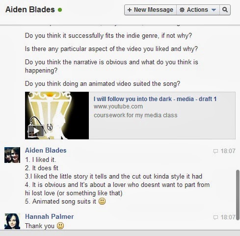
I asked people for some feedback with my music video on the social networking site facebook and also recorded some videos of asking the questions in person.
Feedback questions:
Overall opinion of the video, did you like it, find it
boring etc?
Do you think it successfully fits the indie genre, if not
why?
Is there any particular aspect of the video you liked and
why?
Do you think the narrative is obvious and what do you think
is happening?
Tuesday, 18 March 2014
Sunday, 16 March 2014
Update on progress of animating
After finally working out the technical difficulties with the programs, I only have a few shots left to do and it will be complete which wont take long to do, so here's a shot of sony vegas showing the music video progress so far as evidence I am working on it.
Tuesday, 11 March 2014
Tuesday, 4 March 2014
Update on animation shots
due to broken files im having to reanimate, so here are some new shots I've just redone.
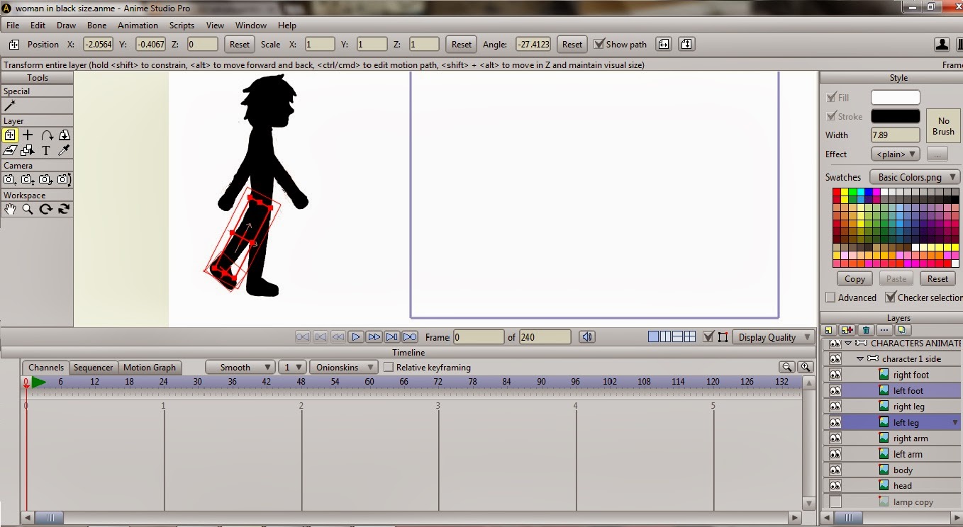
some of the bones used in animating the shots:
Thursday, 27 February 2014
Update on progress
Due to technical issues with my laptop, the programs and files, I have been unable to finish my video on time but here is some of my progress so far to show I am working on it.
Woman in black shot:
Sorting out the bones and effected areas on the character, I had some difficulty with this as it would bend the background as well but by entering the settings and making it sure you couldnt render the background I managed to fix it:
Flower falling shot:
Lines show the path of the petals and I used the rotate tool to help give the petals a more realistic look.
Woman in black shot:
Sorting out the bones and effected areas on the character, I had some difficulty with this as it would bend the background as well but by entering the settings and making it sure you couldnt render the background I managed to fix it:
Rendering the video, this took a few attempts as it wouldn't include the background:
Woman in Black shot:
Lines show the path of the petals and I used the rotate tool to help give the petals a more realistic look.
Shot:
Walking shot:
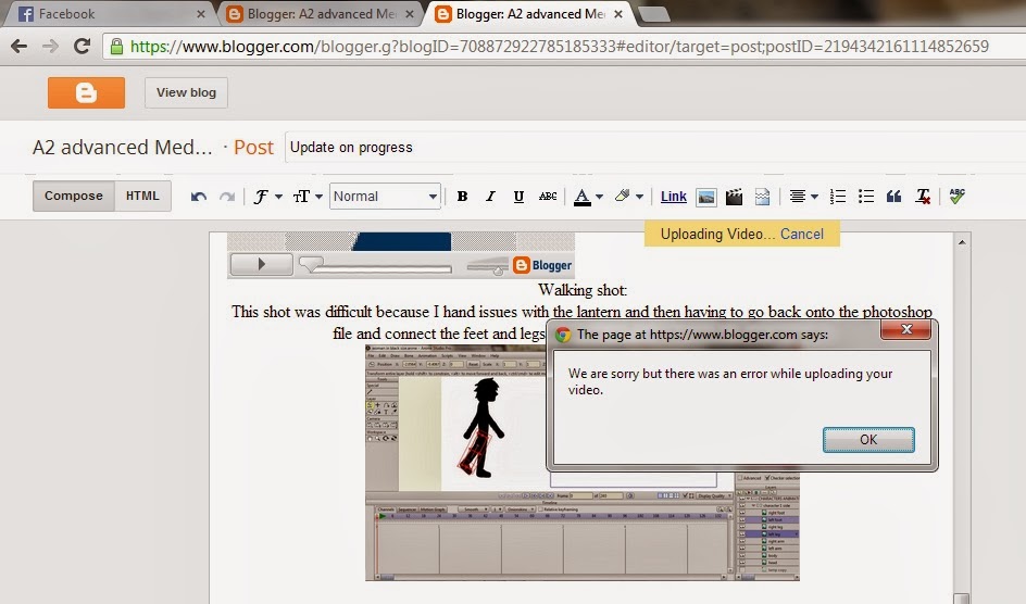
This shot was difficult because I hand issues with the lantern and then having to go back onto the photoshop file and connect the feet and legs together or I couldnt render them properly.
There are some framing issues with these shots but Im working on it and I tried to upload it but it was showing up with an error.


Due to file errors Im having to rework n sort things out but here is a preview of my work until I can add more but I have already explained this to Becky.
Friday, 14 February 2014
Thursday, 13 February 2014
Levi Strauss Theory - Binary Opposites
Levi Strauss's theory was of the contrast of binary opposites for example Good vs Evil, Antagonist vs Protagonist. We don't just understand words purely on meaning but also on reflecting the opposite hence it being binary. Strauss uses this theory to link heavily with how we perceive the world. The understanding of the idea of a villain depends entirely on our understanding of the world as one member of the audience may perceive 'evil' differently to another person. The theory enables the audience to have an understanding of the narrative before it even begins and having opposites within the media allows for a climax and equilibrium to make it more interesting to the audience.
Although I don't have a set character for the role of villain or hero, this theory also still applies to my work with the idea of life and death, with life being the positive and death being the negative role and the video follows the idea of the battle between the two forces.
Although I don't have a set character for the role of villain or hero, this theory also still applies to my work with the idea of life and death, with life being the positive and death being the negative role and the video follows the idea of the battle between the two forces.
Sunday, 9 February 2014
CD developement
For my CD the original idea was to just use the characters created for the music video itself but when I started experimenting with compositions of the characters on the CD case I wasn't sure about how it looked, I didn't think they suited being on the front cover even after coming up with a new design image featuring the lantern used in the video (This image was created by drawing it onto paper first and then scanning the image in and using a graphics tablet to enable me to draw it digitally to create a smoother and clear finish to the image).
First initial ideas:
Looking into the fonts I decided that a script font would suit the album more, as with the song being acoustic it has connotations of it being more personal and emotional to the audience. Along with this, the lyrics are written as if they are talking to their lover so with script font it looks like its Handwritten and almost written like a letter to their lover.
Examples of possible fonts:
I started a new possible idea for the album which including using a drawing of a candle on the front with the text 'I will follow you into the dark' and when the album is opened There is a drawing of the candle being blown out to match the idea of the text in the front. I still plan to include the characters in the album in some way but I want the main focus to be on the candle, which is being drawn to match the idea of the video being animation.
Start of drawing of the candle using a tablet to allow for finer detail:
Start of drawing of the candle using a tablet to allow for finer detail:
Subscribe to:
Comments (Atom)


