Before I animate on animepro Ive decided to work on the harder shots which require me drawing all the aspects and animating it by hand. So here are some print screens of some more of the shots I just need to move but all the layers are there for me to animate.
Because of a few shots requiring me to do it shot by shot, this was planned to be the hardest one I'd have to do. A shot which is a total of 3 seconds and 50 frames. Although because it was done in windows movie maker and going to have to remake it into sony vegas so the frame size matches the rest of the video.
Im not drawing my shots in order, Im getting the most complicated shots out of the way first. The few shots that require me to draw them frame by frame take the longest to do so when they are done it should be a simple process. This is one of the most complicated shots because its a close up of two people holding hands. Which I had to get a reference video so I could draw the movements better. The two images below show the working progress with some of the layers switched on to show the progress.
My first shot requires a different type of animation which requires me to hand draw each frame to show the characters being drawn on. I do this by using layers in photoshop and then using sony vegas 8.
I used the first 60 frames to test the first 1/4 of the first shot
Because of what I'm doing, its helpful if I use multiple programs. So far Ive used:
Photoshop CS5 & CS6
Pro anime Studio
Paint
But now Im having to use Sony Vegas, currently only for the first shot which requires me drawing on the characters shot by shot. So after doing the first half of the shot, heres an example of how its starting out before I adjust the timings so it fits the shot better.
I took a print screen of the program because it shows the 'Bones' I have to use to animate and move the actual character. Along with this you can see the layers in the right corner that I have to use to keep the body parts separate. The program was difficult to get the hang of at first because there are so many options to do but once I learned how to create a 'Bone layer' which would enable me to choose the areas that could move, the rest was just following the steps from the tutorials I watched and the notes I took on my ipod. I had to add a bone to each limb which would then have to be sized and then I'd have to adjust the effected area to around the size of the limb to make it so that it was more realistic and the area it moved wasnt too much on the body and would start to effect other limbs. I also had to edit the parent limbs on the bones, this meant that each bone would be connected to a specific bone so that it would pivot off that bone. So in the case for my figure all the bones were connected to the central bone in the body, so I had to adjust all the arrows so the were pointing towards the centre bone because when I first set them the arrows were connecting limbs to other limbs making my figure move messily and incorrect.
Test run:
Although I had an issue with the video because I accidentally left a large pause at the end of the video.
These are the final character designs for the two main characters, I needed a side view and a front view to be able to do the shots I planned. Each limb on the character had to be edited on a seperate layer (as shown below) to enable me to move them properly once I imported them on to animestudio pro. Although Im going to have to fix the layer with the lantern on as it bend instead of moving when I try to use it in the program but I think if I include it with the layer the arm is joint onto them it should move properly. I had to individually edit the inverted layers as I couldnt just place the invert effect on top as each limb had to be done seperatly and it would change the colour of the rose. I needed the inverted layer for some of my shots so I thought it'd be better if I had some inverted charcters ready to use for when I needed them.
I enlarged the layer area to show 'Character 1's' body layers and how each one has to be individual.
A friend of mine gave me the program Anime Studio Pro to work with, so I thought I'd try some test runs to see how well it works.Along with this I had to watch a large amount of tutorials in order to make sure I could use it well enough to create a music video.
I watched some tutorials on Youtube and took some quick notes on my ipod to help me when I tried the test shots.
The theory demonstrates that even though one message is sent
out that not one understanding is made from the text and allows for a media text to be consumed
individually and takes in to consideration the meaning of a text and the
relationship an individual person may understand from this in connection to sociological
factors.
Hall wrote about 3 different types of audience readings of the text.
Audience types:
·Dominant or preferred – completely agree with
the chosen message by the producer
·Negotiated-Partial agreement, opinion is presented ending in compromise
·Oppositional – Disagree completely and rejects
the preferred reading
There are a few reasons that effect which reading we take. Which are:
·Life experience
·Mood at the time of viewing
·Age
·Culture
·Belief
·Gender
An example of a negotiated reading of a video is Robin Thickes 'Blurred Lines' song. Robin Thicke says his single Blurred Lines is actually about his actress wife Paula Patton and defended the song claiming that the erotic and seemingly aggressive lyrics were harmless and intended to celebrate his 20 year relationship with wife. But although many people see the song as harmless, the song has set off an outrage with many people with them claiming it was deeply offensive and derogatory towards women given controversial lyrics such as 'I know you want it' and 'let me liberate ya'. With the original video being removed from Youtube after so many complaints. This is an extreme example of conflicting opinions on a media product. Which is why I mentioned it as I want the message of my music video to be clear. My music video is based on a song about love and death so I wanted it to be clear what it was about using symbols stereotyped or mentioned with the lyrics and then using a couple in the video.
From working on my animatic I worked out that certain shots were too long or needed to be changed. These shots are: shot 6 - From 11 seconds to 8
Shot 19 - from blank black bakground to a starry sky
shot 22 - from 12 seconds to 8
Im going to download a better version of the song as it cuts out the last word from the song and I had to cut 4 seconds of silence from the beginning of the track.
Alot of my shots seem quite long but some are being drawn onto the shot or have the characters moving which was hard to show in my animatic, so it'd have to be shown through just the animation instead.
Due to doing animation there isnt alot that could be put into the risk assesment as I will mainly be working from home or college meaning I dont have to go on location to film certain shots or include other people in my work.
Using Film and other animation clips as an example, here are some types of animation:
Classic 2D animation: Also known as Hand drawn animation or traditional, each fram is hand drawn and it takes 12 drawn frames for a second. They are later scanned and put together to form the entire piece. This was manily popular until CGI animation.
Digital 2D animation: created similar to handdrawn but done using a digital tablet or mouse instead. Most commonly used in TV shows.
3D digital animation - now the most popular technique, it is done with 3D models that are textured, rigged and animated in virtual space.
Stop motion animation - requires photos to be taken of a subject which is moved or changed gradually so that when the photos are placed on after the other it gives the appearnce of change or movement.
Clay animation - this is a type of stop motion animation but with the figures made out of clay making them possible and giving the producer more room to be creative.
Cut our animation - another stop motion technique but this one is done using many different materials like card, paper, cloth and photographs.
Paint on glass animation - This is done by manipulating slow drying oil paints on sheets of glass
Drawn on film animation - this is also known as direct animation, it is produced by creating images directly on film stock unlike any other form of animation.
A- Higher Managerial, administrative or professional. 3%
B- Intermediate managerial, administrative or professional. 15%
C1- Supernisory or clerical, junior managerial, advisory or proffesional. 23%
C2- Semi skilled manual workers. 28%
D- Semi skilled and unskilled manual workers. 18%
E- Casual Labourers, unemployed, state pensioners. 13%
The National Readerships surveys social grades are used in all advertising and market research. It is also used by all institutions involving an audience. These social grades are largely based on estimated income and profession. Age is usual categorized into the following: <15 15-24 24-35 55> With male/female categories. The target audience I would be aiming for would be largely within the 15-24 age category due to the fact this will largely include students and teenagers/young adults have the most disposable income and are more likely to spend their money on music. Meaning they will also be more likely to watch music videos on Youtube and music channels due to wanting to stay up to date with recent music with their peers. This will make my target audience in the D and E sections of the national readership survey and I don't think it will target a specific gender out of the two.
This was my first attempt at a focus group but it wasn't really a success as there is issues with the sound and lighting, along with this not everyone answered the questions fully. So I'm going to attempt another focus group, try a smaller group and ask them to answer in more detail as any feedback I receive would be helpful for my music video.
When you hear the name 'I will follow you into the dark' what do you think its video would be about?
what conventions or stereotypes would you expect to be associated with an indie music video?
what makes you want to watch a music video instead of just listening to the song?
Do you prefer a narrative in music videos, if so or not then why?
How often do you watch music videos and where do you watch them most often?
Has a music video ever persuaded you to buy a song or an album and was there any particular reason?
What are the first things you think of when you hear the term 'Acoustic song'?
I asked these questions in hope that I'd be able to get some information and feedback which would be helpful in designing my music video as I'd be able to find out what people consider the conventions of that style and what they'd expect out of the song itself.
I gathered some existing character designs from indie music videos in order to show the variety of styles used in them. Although silhouettes are commonly used throughout the genre, but by looking at these characters it showed me ways to which I could experiment with colour and art styles making my video more memorable.
I gathered some images of existing images of indie bands so that if I chose to design characters off the band I'd have some examples of indie style and fashion commonly featured with indie artists. Along with this it allowed me to gather some more information on the current indie music scene instead of just the past. Using music Roamer, I made a mind map of similar artists and opened up a few indie artists I knew to show links between them all.
Live performance is a common feature used in Indie music videos due to the idea that it makes the main focus the music itself instead of drawing the audience in with a narrative of the video. Along with this it shows the artist doing what they love and have passion for, considering its more common in Indie or rock genre music for them to care less about success and care more about playing the actually music. Another reason for using live music in their videos is that it shows a natural talent because it hasn't been finely tuned in a studio and it also helps show the passion they have for their music. Live performances in videos as help the viewer experience what the atmosphere is like at one of the shows, making them want to go themselves which will be encouraged by showing people dancing in the crowds as shown by the Black keys video below. Although commonly now artists have started using small narratives between the live performances, making the video more memorable helping them compete with other artists.
Mise-En-scene used in music videos play a large role music videos but especially in Indie videos, along with this in indie videos they commonly follow the 'retro look' which is often related to indie clothes fashion itself. The costumes impact largely on the music videos as conventionally it helps show the audience about the artists or the songs narrative. 'Kitchen sink' Mise En scene is often used in indie music videos as they are commonly set around day to day lives so basic props are essential to be able to great the verisimilitude which makes people relate to the image. Although in the case of Gotye's video below it emphasizes on certain objects and aspects of normal life into a cartoon fashion to make them appear comical to its audience. Sound is obviously important in music videos but added extras change depending on the style. For example if an indie artist chooses to use a live performance it commonly features the crowd screaming in the beginning but by choosing to use a live performance it also helps the audience appreciate their musical talent more. But diegetic sounds are also used to help the narrative in music videos, with the example of Gotyes - easy way out which starts with ambulance sounds in the background and then the alarm ringing as a sign he's about to wake up which are both sounds the viewer is used to making it more relate-able to them.
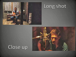
Camera angles in Indie music videos tend to largely use close ups to help express the emotion or lyrics in the song playing, other common camera shots are Long shots to help show the location or the artists themselves and the costume they are wearing, because some artists are known as style icons and the costumes are memorable and make an impression on the audience which can help people remember the music video even more. There is also crane shots mainly used for live performances as it can view the band over the crowd and allow for different angles to be used whilst keeping a smooth transition between the frames.
Using as an example:
Editing wise the must commonly used is a fast cut which allows for the video to change locations swiftly which is often done to the beat to emphasize the song itself, along with this another common editing technique is the fade which works well for slower parts of songs due to it being a gentle edit. Some music videos for the indie genre also use effects on top of the video to add an aged look which often fits in with the vintage theme of costume commonly used in these videos. This is commonly a black and white effect or a sepia effect to make it appear rusty and old.
Before the idea of music videos began, in the 1926 the 'talkies' arrived which included many short film largely featuring music and many featuring bands, vocalists and dancers. Even animation was used in these for example with the animation artist Max Fleischer. This man created 'Screen songs' a series of sing along cartoons which was intended so that the audience would sing along by following the ball on the screen which is similar to karaoke now. This could been seen as the earliest idea of music videos.
This idea was carried on in the 1940's with the introduction of 'Soundies'. Which were 3 minutes films with music showing dance and music performances meant to be displayed on a jukebox like projection system in bars and other public places. Music Videos are often now referred to as 'Promotional videos' or 'Promos' which is to do with the idea of it being used for promotional purposes for the band by making it so the video appeals to a wider audience and can be viewed on different places for example 'YouTube' or TV which helps reach a broader audience. In the past, artists didn't use music videos. Instead choosing to use films originally starting with the example of Cliff Richard's 'Summer Holiday' in which he played a fictitious character but his music was played throughout the film, the served as promotional services before individual videos where made.
The Beatles broke this trend with their series of movies in which they played themselves which was a new concept at the time. With their first being 'A Hard Day's Night', directed by Richard Lester in 1964. Although in 1967 the first generally regarded music video was made for Bod Dylan, which was shot in one continuous shot. Featuring Dylan holding up flash cards and dropping them to show the lyrics playing at the time, this video was the first to start a new trend. Pink Floyd continued this idea of promotional videos especially with their films for their songs including "San Francisco: Film", "Scarecrow", "Arnold Layne" and "Interstellar Overdrive". This idea especially took off in the 70's/80's with the creation of Rock videos, although the term isn't used a much now due to them just being referred to as music videos, this idea became incredibly popular in promoting new bands at the time.
Another moment in music video history was with the two week teen orientated music programs available in Australia in 1974. In early 1974, former radio DJ Graham Webb launched the TV music show which was shown on Sydney's ATN-7 on Saturday mornings; this was renamed Sounds Unlimited in 1975 and later shortened simply to Sounds it became popular and quickly gained a following which caused other countries to follow this idea. In 1978 3 years before the release of The Buggles 'Video Killed on the radio star' on MTV the american program, 'Video Concert Hall' Began showing several hours of un-hosted music videos everyday. The British show 'Top of the pops' show began in the late seventies, although the BBC had strict limits on the number of 'outsourced' videos the show could use. In the 1980's David Bowie had his first UK number one in nearly 10 years which was largely due to the promo video of his song 'Ashes to Ashes'. Although 1975, 'Queen' hired Bruce Gowers to make them a music video for their new single 'Bohemian Rhapsody so it could be shown on Top of the Pops. The American vidoe channel 'MTV' was launched in 1981 which started the era of 24 hour music television.
Conventionally music videos tend to narrate the story featured in the lyrics, commonly by using montage editing to switch between the story and the band members playing. Along with this another convention of music videos is that they generally use close up shots or mid shots to show the emotions or mood of the song overall, that and it allows people to see the band working as promotion for them along with emphasizing the lyrics in the song. Jump cuts and fades are common edits used in music videos as it allows for quick transition between location or with fades used as a change from them. Whilst tracking shots and pans are also conventional to music videos as well. The lighting and props used in music videos depends entirely on the genre of music it is promoting, as a pop music video would probably involve bright and colourful lighting whilst a metal music video would require darker and more dramatic lighting. After analysing some existing media texts for music videos, I was able to notice some common conventions in them. For example the narrative of music videos especially 'Indie' genre ones tend to be formed around the idea of a journey, along with this it generally stems from the idea of being alone and searching for love. If they aren't searching for it love plays a large part in them.
Previous to starting my media course I’d taken photography at GSCE level for 2 years so I already had a basic idea of photo editing on Photoshop along with this I also practice digital drawing at home so It meant that I learnt a large amount of Photoshop from doing that before I’d even started the course. But because of this I thought my product of doing the college magazine would turn out better than it did but it helped show me weaknesses which I could then develop and improve throughout the year. Originally my photo for the college magazine could have been taken with a better background which didn’t require me to use a banner on the side to make text easier to read. Later on in the course I learnt a lot more about taking photos that aren’t just physically appealing but suit their purpose for example I learnt how to make differences in the type of camera shot, the lighting needed and the models chosen to make it so photos work for different magazines. At the time I thought my digital skills were quite strong at the beginning of the course but throughout the year I’ve learnt a lot about lighting, shots and how to manage the digital technology to make the product more appealing. This is especially shown when I compare the college magazine to my rock music magazine. Another skill I learnt through my course was using conventions in my products to help them fit their purpose which after doing several drafts for my rock music magazine I finally got up to a standard of fitting conventions I was happy with which made it turn out more successful than if I’d try to do it at the beginning of the year. Not only did I become more practised with using technology to help in my work I was also able to improve on my research before beginning the actual product, the research I did was key to how much information I could use to improve my own magazine. I wasn’t very good at analysing magazine covers at the beginning of the year and it’s still something I’m not very strong at but I’ve still improved quite a large amount compared to when I first started as I’ve learnt more of the terminology but I still get some of the terms muddled up sometimes. I struggled a bit with the research as it was something I didn’t enjoy doing very much at first but once I got the hang of it then I didn’t mind it as much but I much preferred being able to work on the product itself because it allowed me to be creative. Although I started using different ways of producing my research towards the end of the year which made it more enjoyable for example ‘Prezi’s which made it feel like I wasn’t just writing large blocks of plain text. I take a lot of creative courses on side to media so being able to produce pieces of work on Photoshop fit in well with skills I’d already learned from other courses making it something I find a lot easier. As I tend to be better at producing images and pieces of work similar to that than I am writing as it’s never been a strong point of mine. Being able to choose what genre also helped me because it meant I could include bands and other things which I personally liked making it less of a task and more enjoyable. I struggled a bit with choosing fonts at the beginning of the task because of the large amount and it was hard to choose the right ones which I thought suited their purpose but I started to get the hang of it by the end of the year. I struggled with planning quite a bit as I prefer just being able to start on the product straight away and experiment on what works with it that way so I wasn’t very good with planning in advance at first. The planning did help me a lot as it helped me reduce the amount of choices I had for my work so I could focus on what I needed to get done for a final piece to be produced but it’s still something I don’t particularly like to do. Meanwhile the production of the tasks turned out better then I planned when it concerned my music magazine. I originally had the problem of not being able to get the right colour scheme for my photos, the first shoot I did turned out too yellowy because of the lighting and the second was too dark because I tried to use a spotlight. In the end I managed to get it right with taking the photos in natural sunlight so it was lit well but I wish I’d used red extensions in my front cover models hair instead of blue so it’d suit the colour scheme more. But overall my main improvement has been to my writing as when I first started the course I struggled to be able to analyse anything and although I’m still not very strong at it now I can now analyse things a lot easier and know what to write about them but I need to relearn some more of the terminology as by the end of the year there were terms I kept forgetting. I did get some audience feedback at the beginning when I did my college magazine but by the end I was more confident getting feedback using different methods for example questionnaires and videos recording student feedback, I could have done some more for audience feedback but I never did which is something I wish I’d done better . My skills using Photoshop developed as well but my main problem was getting photos and fonts that suited the product, which granted I improved on a bit compared to the beginning of the year but I still have room for more improvement to do with these aspects of designing final products.
Although this video doesn't follow my genre of 'Indie music' because its more of a jazz genre but the style of animation is very interesting and it still follows the conventions of indie videos partially. Due to the fact indie music videos are in commonly black and white, the animation in this video is mostly in black and white with the exception of some red and yellow. The red represents desire and sin, this is shown because its normally only featured when the character is committing some form of sin or is desiring something/someone, for example red is featured when he tries to murder the dog or its also used when the women is involved as she represents lust. Along with this red has connotations of hell and sin so its used when the character falls into hell. The red helps develop the narrative as it makes it more understandable to the audience where the character has ended up because of the lyrics and the connotations of red connecting to the devil. Along with this the use of red helps continue the narrative by having the woman in red and the theme of it continues with the dog who in the the lyrics is said to be left by her father to guard her. So when the red is used to show he's in hell and its shown its the devils hound, the audience can make the connection of she's the devils daughter which goes back to her representing sin. Along with this Yellow is used to show the windows on the building emphasising the idea of it being at night.
The cinematography is kept largely to a an extreme long shot as it allows for more of the location to be shown which helps develope the narrative, along with this it shows the wind blowing through the trees on the night which gives the idea to the audience that he's doing something he shouldn't due to the connotations that people shouldn't be out at night as its unsafe. Along with this it also shows the size difference between the man and the building the woman is trapped in which emphasises the level of the task he's willing to commit for her.The videos also uses some extreme close ups mainly being on the woman as well but on the most part its kept to extreme long shots.
The animation itself is designed to have a comical effect due to the way the characters are designed for example the man is designed with thin spindley legs and arms which add to the idea of him being a crook due to the connotations of bad characters being quite thin which is shown in a lot of cartoons. Along with this the song is always shown to be panting but it makes it seem like he's smiling at the same time which to the audience gives the idea of it being a big joke to him.
The genre of this music video fits into the indie genre more then the previous text studied but instead of following the idea of the video being in black and white, this animation does the opposite. All the parts of the scenes are made using bright colours which all have individual textures making it more appealing for the audience to look at. By using the wide variety of colours in allows for certain aspects of backgrounds and props to be exaggerated and unrealistic making them suit the idea of the creature travelling round the world to find a girl. But another convention of this genre I've noticed is that they tend to be slow paced which is shown in this video throughout it which also emphasises the idea of being lonely due to everything being dragged out. The cinematography on this text is quite varied but still follows the idea of using alot of long shots which Ive noticed is common in music videos involving animation. Which is used to help show the development in story more because of the space it allows in the shot which could perhaps shows changes of scenery etc. The use of close ups in this video is used to give the idea of depression from the creature, the camera shots change a lot with this video as it allows for them to show different types of moods to the audience as the creatures design itself doesn't show emotions using facial features. two of the shots in particular show the passage of time, the first one is a long shot of the cabin which shows the night spinning into day and vise versa which gives the impression of routine because of nothing in the surroundings changing other than the sky. Whilst the other shot is an extreme close up of the creatures bag showing more stickers of locations fading onto his bag as he walks which represents him travelling all over the world. The editing of the video is mainly cuts and doesn't really involves anything else which is common in animation videos. When the the female creature is involved red tends to be used as it has connotations of love, even the creature itself is red which connects to the idea that he loves this creature. Along with this birds are shown flying into a red sunset showing the shape of a heart once again representing the female creature.
The entire narrative is about this creature being lonely and travelling around the world to find love and in the end finding the creature he was originally with which is shown by the ripped photo it holds in the beginning of the video. The narrative is largely demonstrated by the props drawn in the video. For example he's shown to be missing someone by the idea of it holding a ripped photo, this is continued by the patches on the bag showing him travelling, with the birds forming a love heart into the direction the other creature is when he finally finds it and they match the photos up again. The scenes at the beginning and end of the creature eating alone first and then by end it shows the same actions but with him eating with the other creature which is the resolution of the narrative. The idea of a fantasy world in which this video is set would be appealing to audiences because its a unique world which makes the narrative absorb the viewer, along with this the colours and textures used make everything look abstract creating an unusual look to all of the characters
This videos cinematography is kept to one single frame, because its done with stop motion photography on a whiteboard its kept to a long shot with continuous editing. This breaks conventions slightly because indie music videos normally include close ups in the cinematography of their videos. The narrative of the actual video is that of someone dreaming of finding love and it shows multiple scenes related to finding love including that of modern day romance of buying each other gifts to show love as represented by the signs drawn on the buildings with one saying 'buy' and the opposition saying 'love' giving the idea to its audience that as a mass population (shown by the idea its over a city) we believe in artificial romance that must be purchased, but on the other hand it also shows the scene represented in the bible with Adam and Eve with Eve succumbing to listening to the snake into taking the heart representing love in its earliest forms, which the snake could also have connotations the negative . Along with this the scene in which the lone man is left besides an igloo, the blues and purples are used to give the idea of it being colds due to their connotations with ice and being cold colours, this helps represent the idea of him being isolated and alone. But to combat this it also continues the narrative to his quest of searching for love which is shown with the heart attached to the arrow he is firing representing him searching. Like a lot of music videos following this genre it is largely in black and white but it sill features colour occasionally which helps highlight particular items of importance to the narrative or to make the background more appealing to look at with the plain character standing out in front of the vivid colours. towards the end of the video it completely breaks the convention of indie videos being dark or black and white by having colourful drawings all over the frames, which all move and combine with each other, this is to represent the man finding love and the positive feelings on love. Bright colours often have connotations to happiness and other positive feelings. This is to show a resolution in the narrative of the music video. This makes it more appealing to the audience as it shows a happy ending to the overall narrative which tends to be more successful.
A promotion package for the release of an album, to include a music promo video, together with two of the following three options: - a website homepage for the band - a cover for its release as part of a digipack (cd/dvd package) - a magazine advert for the digipak (cd/dvd package)
Close ups are used to emphasise the use of words and emotions
in the songs whilst longs shots, close ups and mid shots also are common. These
are so it can shows the artist, location and props more. Camera movement tends
to largely follows the band or artist, using tilts, pans, track and cran shots.
Editing:
Jump cuts are largely used in music videos to allow quick
change from location but fades are also commonly used as a change from the
cuts.
Lighting:
A lot of music videos
are black and white which helps emphasise the mood and another use of lighting
in music videos is using artificial lighting to create an atmosphere or put the
artist in an enhanced look.
Music conventions in Indie/Rock:
·Black and white is common
·Dark locations
·Use of extreme close ups or long shots
·Some special effects
·Fast paced
·The artist or band tends to be shown throughout
the video.
I wanted to do a music video experimenting with animation so I tried to find one which would only use a quite simple style. But in order to match the genre of music I wanted to do, this was as close as I could find, I want to use an acoustic style indie song in my music video. So I did some of the beginning of the music video in a storyboard presentation.
For our transition from AS media to A2 we
were asked to recreate a 1 minute of an existing music video, we chose to do
‘Frank Turner – The way I tend to be’. This was chosen because of the location
and costume being quite simple so we thought we’d be able to do it more
successfully compared to if we tried a more difficult one. Although we didn’t
consider the amount of shots needed in the first minute so if we did it again
I’d want to chose a video with less shots in the first minute for example like
the Snow Patrol chasing cars video which has fewer shots and also uses a simple
location. We didn’t choose this video in the first place as we thought we’d be
able to do the Frank Turner one without a problem. We also encountered problems
with the storyboard as it was missing a few shots when we took it out as a
reference when we went filming so we had to improvise a few shots in the
editing with the footage we had taken doubles of just in case some had gone
wrong.Another problem we encountered
was when our main actor Connor turned up for the last 7 shots of filming in the
wrong clothing we needed for the filming so once again we had to change it
slightly. We had to stop originally filming when we tried to get it all filmed
in one shoot but we had to stop 7 shots short when it started to rain and
because of the fact we were in a field we had to move quickly to avoid getting
any rain on us or the equipment. We also had problems with our actual team as
Connor wasn’t here one of the days we needed him to bring in the files we
needed or he’d turn up late to filming in the wrong costume. Ford wasn’t here
two of the days so with people being off on different days it made it quite
hard to do some of the filming and editing at times. The video itself was a little bit dark in a
few shots which if we tried to recreate it I’d want to sort this out.
So even though we had quite a few problems
with filming etc I still think we did quite well in the editing as when we
played it against the actual music video to check the timing it matched up quite
well with each other, along with this we made sure the shots in which Connor
had to sing matched up with the lines in the song.I also think that the planning and
preparation went quite well as it we got it all done quite quickly and without
too many problems.
So overall I enjoyed the project even if it turned out to be quite problematic
at times but I am quite happy with out final project and we even had enough
footage left over to make a bloopers reel.